

Related Products
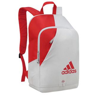
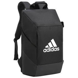
Adidas VS6 Backpack
HK$ 382.00
HK$ 640.00
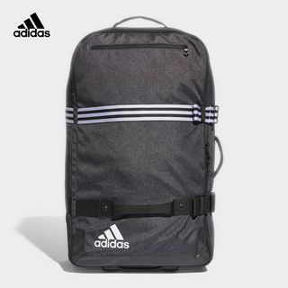
Adidas 3S XL Trolley Bag (140L)
HK$ 1134.00
HK$ 1620.00
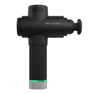
Hyperice Hypervolt 2 Pro
HK$ 2999.00
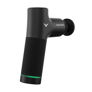
Hyperice Hypervolt Go
HK$ 1099.00
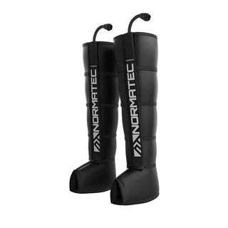
Hyperice Normatec 3.0 Legs Recovery System
HK$ 6999.00
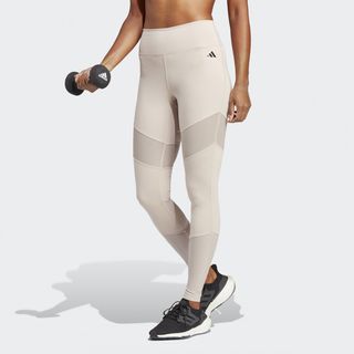
Adidas TAILORED HIIT TRAINING 7/8 LEGGINGS
HK$ 299.00
HK$ 599.00
Adidas Essentials Dance Tight
HK$ 199.00
HK$ 399.00
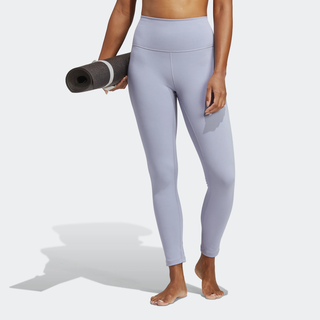
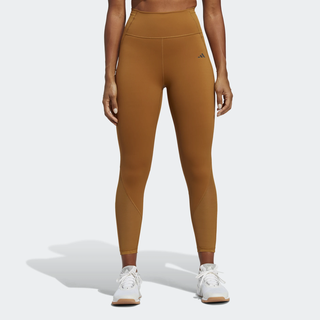
Adidas YOGA STUDIO 7/8 LEGGINGS
HK$ 249.00
HK$ 499.00
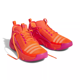
Adidas D.O.N. ISSUE #4 Basketball Shoes
HK$ 449.00
HK$ 899.00
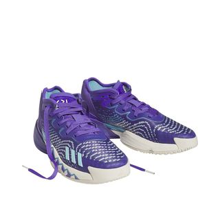
Adidas TRAE UNLIMITED Basketball shoes
HK$ 349.00
HK$ 699.00
Adidas VS .7 Backpack
HK$ 297.00
HK$ 440.00

Adidas CrazyFlight Tokyo Indoor Shoes (20)
HK$ 756.00
HK$ 1260.00

ADIDAS NOVAFLIGHT VOLLEYBALL SHOES
HK$ 585.00
HK$ 899.00

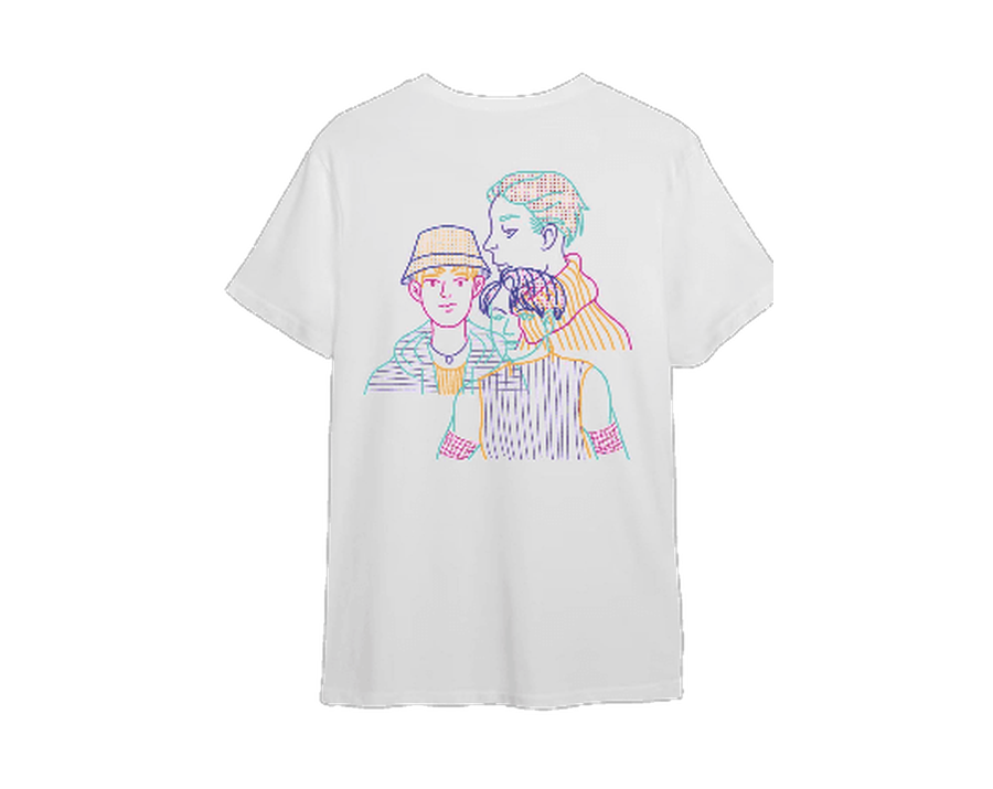
「 自己 Tee 自己話事」設計比賽T恤 — 公開組季軍
HK$ 150.00